
Calibration of probabilistic predictions is a crucial task in many machine learning applications, especially when the outputs are used downstream for decision-making.
It’s actually a simple concept, with calibration just ensuring that the predicted probabilities align with the actual outcomes. Despite that, I’ve noticed many people neglect the step in their modelling process!
Typically, when calibrating a classification model one would reach into the sklearn toolkit and use the CalibratedClassifier with Platt Scaling or similar. For those new to this, I’d recommend starting your journey there. Sklearn provides friendly, easy to use, out-of-the-box functionality.
However, in this article we’re going to look at calibration with a bit of a twist. We’ll use GAMs. GAMs are a flexible tool for modeling non-linear relationships between variables and can be adapted for calibration. Why do it this way? Well, this approach provides a couple of nice advantages:
- We don’t have to worry about binning, GAMs provide smooth estimations
- GAMs can provide us with confidence intervals for our calibration curve
With that in mind, let’s explore the concept of calibration using GAMs, focusing on their implementation using Python’s pygam library.
What is Calibration?
In classification tasks, especially in binary classification, models often output probabilities that represent the likelihood of an instance belonging to a particular class. A well-calibrated model means that these predicted probabilities correspond to the actual observed frequencies. For example, if a model predicts a probability of 0.7 for an instance, then, over many predictions, the model should be correct approximately 70% of the time for instances where the predicted probability is 0.7.
Calibration is often visualized using a calibration plot (or reliability diagram), which compares predicted probabilities against actual outcomes. If the predicted probabilities are perfectly calibrated, the points on the plot should lie on the diagonal line y=x, indicating perfect alignment.
Using GAMs for Calibration
Generalized Additive Models (GAMs) are a class of models that extend generalized linear models (GLMs) by allowing the inclusion of smooth functions of predictors. This flexibility makes GAMs suitable for tasks like calibration, where the relationship between predicted probabilities and actual outcomes may not be linear. Instead of assuming a fixed linear relationship, GAMs can model complex, non-linear trends, allowing for more accurate calibration.
The process of calibration with GAMs generally involves two steps:
- Fitting a Logistic GAM to the model’s predicted probabilities and actual outcomes to learn a calibration function.
- Correcting the predicted probabilities based on the fitted GAM to generate calibrated predictions.
Fitting a Logistic GAM for Calibration
The first step involves fitting a LogisticGAM to the data. A LogisticGAM is used because the task at hand is binary classification, where we want the model’s predictions to be probabilities between 0 and 1. The logistic link function is ideal for this task.
from pygam import LogisticGAM, s, GAM
gam = LogisticGAM(s(0, n_splines=8)).fit(y_prob, df['a_bin'])
Here:
y_probis the array of predicted probabilities from the model.df['a_bin']is the binary ground truth labels (0 or 1) for the instances.
The s(0, n_splines=8) specifies a smooth term for the predictor variable (the predicted probabilities, y_prob). The n_splines=8 argument controls the (maximum) number of splines used in the smooth function, allowing flexibility in modeling the relationship between predicted probabilities and actual outcomes.
Generating Predictions for Calibration
Once the LogisticGAM is fitted, the next step is to generate predictions using the fitted GAM model. These predictions represent the calibrated probabilities, which can then be compared to the original predictions.
y_pred = gam.predict_mu(y_prob)
The predict_mu method returns the expected value of the model’s predictions, which are the calibrated probabilities.
Confidence Intervals
To quantify the uncertainty around the calibrated predictions, we generate confidence intervals using the confidence_intervals method. This is crucial for understanding the variability in the model’s predictions, especially when the model is used for decision-making under uncertainty.
XX = np.linspace(0, 1, 100)
preds = gam.predict_mu(XX)
intervals = gam.confidence_intervals(XX, width=0.95)
Here:
XXrepresents a range of predicted probabilities from 0 to 1.predsare the calibrated predictions for these values.intervalsare the 95% confidence intervals around the predictions.
Plotting the Uncalibrated Curve
Now that we have the calibrated predictions and confidence intervals, we can plot the calibration curve.
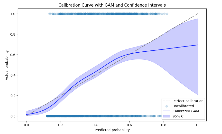
- The gray dashed line represents perfect calibration, where predicted probabilities exactly match actual outcomes.
- The blue line shows the calibrated predictions from the GAM.
- The shaded area represents the 95% confidence intervals, providing a measure of uncertainty around the calibrated probabilities.
Calibration of Predictions
Finally, the code performs the calibration of the predictions using the fitted GAM. This step adjusts the original predictions to correct for any biases, ensuring better alignment with the actual outcomes, simply subtracting the difference between curve and our diagonal line.
gam_cal = GAM(s(0, n_splines=8)).fit(y_prob, y_pred - y_prob)
y_calibrated = (gam_cal.predict_mu(y_prob)*-1) + y_pred
Here:
gam_calis a new GAM that models the residuals (the difference between predicted probabilities and actual outcomes) to learn how to adjust the predictions.y_calibratedis the final calibrated prediction, which incorporates the correction learned by the second GAM.
Corrected Calibration Plot
Now we plot the corrected calibration plot using the same method as before, but now showing the properly calibrated predictions.
XX_cal = np.linspace(0, 1, 100)
preds = gam.predict_mu(XX_cal) + (gam_cal.predict_mu(XX_cal)*-1)
intervals = gam.confidence_intervals(XX_cal, width=0.95)

plt.plot([0, 1], [0, 1], linestyle='--', color='gray', label='Perfect calibration')
plt.scatter(predictions, targets, label='Uncalibrated', alpha=0.2)

plt.plot(XX, preds, label='Calibrated GAM', color='blue')
plt.fill_between(XX, intervals[:, 0], intervals[:, 1], color='blue', alpha=0.2, label='95% CI')

plt.xlabel('Predicted probability')
plt.ylabel('Actual probability')
plt.title('Calibration Curve with GAM and Confidence Intervals')
plt.legend()
plt.show()
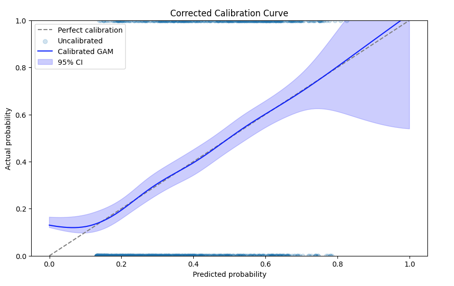
You can see that the predictions are much better calibrated, with the calibration line falling almost exactly on the diagonal as required!

Leave a comment