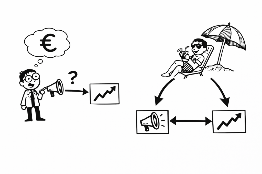
Double Machine Learning (DML or DoubleML) is one of the most powerful, modern techniques in data science & machine learning. However, I often find treatments of the subject a little convoluted, with writers reaching for math or using very particular domain vocabulary. In this article I’m going to drop the math, avoid all the jargon and instead try to give you an intuition for the technique and why it’s useful.
First, let’s start with the problem statement. You might have seen something like this before in your work.
Let’s say you’re trying to figure out how much marketing drives sales for your product. You’re quite sure that the marketing is somewhat effective – in the low season you pump marketing budget into your various channels and the sales appear to pick up. Things look promising but how good is the return on investment? You’ve got data on your marketing spend, sales, and maybe a few other variables. You run a regression: sales as a function of marketing spend, expecting a nice positive effect. You know that increased spending and discounts produces more sales. This should be easy.
Instead, you get a negative coefficient. It’s telling you that spending more on marketing actually reduces sales.
Wait, what? That’s not possible.
This kind of result makes people second-guess the whole project and data science in general. You start wondering if you messed up the data, or maybe marketing just doesn’t work, or maybe the model is too simple. Management starts to question your competency.
And many people stop there. They don’t know how to fix it, so they just drop the question entirely. Or they blame a lack of data, saying the model isn’t complex enough. Some would even be bold enough to suggest that the effect is indeed negative!
The Problem
Here’s what’s probably going on: your treatment is confounded. I promised no jargon, so let me rephrase that. Something is influencing (driving/causing) both the marketing spend and the sales, leading to a flipped (or biased) effect. Let me draw a diagram to illustrate
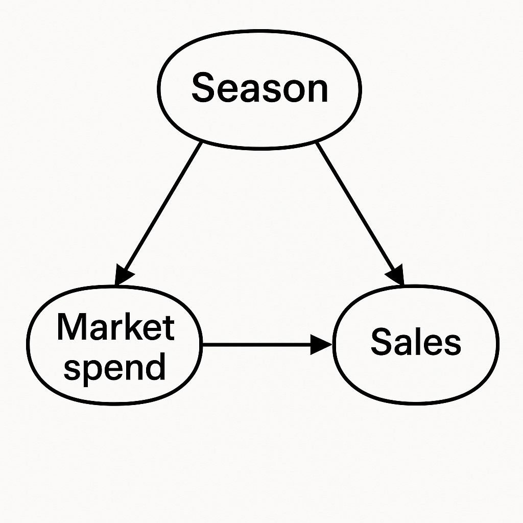
This diagram is called a DAG (directed acyclic graph) by practitioners but that’s not really important. This diagram shows how each variable drives (causes) the other.
Think back to our example. Our hypothetical company sizes it’s marketing spend based on the season. In the low season, they pump money into marketing and in the high season let things run, aiming to smooth things across the year. This means that when the sales are naturally low, the marketing spend is high! And our rookie analyst might interpret this to mean that high marketing spend causes low sales. Many people use the trite phrase “correlation does not equal causation” in these situations. But really, we can do better than that.
So, that’s where these DAG diagrams come into play. We draw the diagram to make explicit the relationships and we note that the season impacts sales directly and via the marketing spend too. The effects are tangled up. We need to make an adjustment that separates the effects, and so we want to get rid of that season bubble.
OK, but the data is the data. You can’t just change the DAG. Or can you? Well, in fact, under some conditions this is possible and is essentially the basis for Double Machine Learning (ML).
How Does Double ML Work?
At a high level, Double ML does something very simple. Instead of trying to estimate the marketing effect directly, it first asks two easier questions:
• Given the season (or anything else), how much marketing would we expect?
• Given the season, how many sales would we expect, even without marketing?
In other words, it learns what “normal” looks like. Once it has those two predictions of “normal”, it subtracts them from the original data to get only the left overs. The abnormal or the unusual.
In other words:
- the part of marketing spend that isn’t explained by season
- the part of sales that isn’t explained by season
Then, once you have these two parts you just see how they move together. In a sense, with season is no longer messing things up we’ve removed the bubble from the DAG.
You might ask “what does it mean to have left overs” for marketing spend and sales? Well, its really just about what’s unexpected or unusual. This could be something like:
Given the season, this marketing was really high! Did we see unusually high sales in response?
Double ML Example
Technical Note: In the spirit of simplifying things, the following example ignores two key aspects: 1) The set-up is very important. Double ML is only valid if everything is properly accounted for 2) Since I’m lazy, I’m going to fit and generate residuals on the same data set. In practice, any overfitting or underfitting biases the estimates. Be sure to use cross validated residuals.
OK, let’s actually solve this example for real. I’ve simulated season, marketing, spend data in the cell below. Note that I’ve kept it to two discrete seasons to keep things simple; low and high.
In addition, you can see that the marketing spend is high in the low season, and low in the high season.
import numpy as np
import pandas as pd
import matplotlib.pyplot as plt
from sklearn.linear_model import LinearRegression

np.random.seed(0)
n = 1000

# Season: low (-1) to high (+1)
season = np.random.choice(["low","high"],size=n)

# Marketing increases in low season
marketing = np.zeros(n)
season_effect = np.zeros(n)
for s in range(len(season)):
    if season[s] == "low":
        marketing[s]= 100 + np.random.normal(0,5)
        season_effect[s] = 3
    else:
        marketing[s] = 20 + np.random.normal(0,5)
        season_effect[s] = 11.5

# Sales naturally higher in high season
# Marketing actually boosts sales
sales = (
    5 + season_effect + 0.1 * marketing + np.random.normal(0, 1, n)
)
Remember, our hypothetical company time their marketing to smooth out the sales across the two seasons. Let’s see if they were effective:
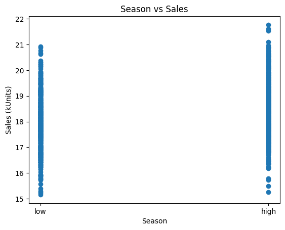
Yep! High season has similar sales to the low season, relatively even across the year. Now, let’s use a simple scatterplot to see the impact of marketing:
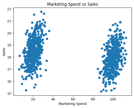
Oh. Marketing spend drives sales down!? That can’t be right. It must be a lack of data or maybe we need to use a Deep Neural Network
Well, not so fast! Let’s remember our DAG. We know that season causes marketing and sales, and we have that triangle in the graph. We need to get rid of the season bubble using DML. For real problems you can use a proper DML package but let’s just do this manual for illustration.
First, we find the expected marketing spend for each season:
# First stage: marketing ~ season
df['season_num'] = df["season"].map({"low": 0, "high": 1})
model_marketing = LinearRegression().fit(df[['season_num']], df['marketing'])
marketing_pred = model_marketing.predict(df[['season_num']])
marketing_residual = df['marketing'].to_numpy() - marketing_pred
Then we find the expected sales for each season:
# First stage: sales ~ season
model_sales = LinearRegression().fit(df[['season_num']], df['sales'])
sales_pred = model_sales.predict(df[['season_num']])
sales_residual = df['sales'].to_numpy() - sales_pred
Let’s plot the leftovers from both marketing and sales to see what it looks like:
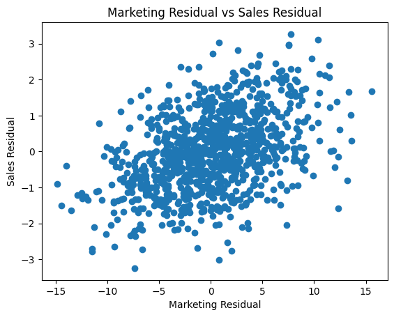
Looking much better already. But let’s complete the process and model unusual marketing vs unexpected sales:
# sales_residual ~ marketing_residual
model_effect = LinearRegression().fit(marketing_residual.reshape(-1, 1), sales_residual)
beta_dml = model_effect.coef_[0]
print(f'Double ML effect (marketing on sales): {np.round(beta_dml,2)}')
print(f'Actual Effect on Sales: {0.1}')
And you should get something like:
Estimated Effect of Marketing = 0.09
Actual Effect of Marketing = 0.1
Perfect!
Technical Note: a regression with sales ~ marketing + season will also suffice in this simple case. This is where the topic gets complicated; confounders, controls, non-linearities, interactions, mediators, colliders. I highly recommend Causal Inference for the Brave and True, the free e-book, as an excellent entry point to further learning.
Summary
If your model says marketing hurts sales, or that price increases boost demand, or anything else that just feels wrong — it might not be the data lying to you. It might just be the confounders in the background biasing your effects.
DoubleML is a way to fix that. It gives you a structured approach for isolating causal effects, even when everything is tangled together.
And maybe best of all, it gives you the confidence to keep pushing forward to find the right answer, even if your data is challenging.

Leave a comment